Posted in History & Literature

Designing Under Constraint

You would think that the more freedom the designer has, the more their creativity can flourish and they can produce more original, greater ideas. But it is a well-known fact in the design world that the the best designs are produced when designing under constraint.

Consider the beauty of the canal houses of Amsterdam. In the 17th century, plots of land by the canal were allocated in narrow (but deep) portions to maximise the number of houses. Architects worked around this restriction, resulting in the narrow, tall houses of various shapes and colours that we see today. Another architectural example is Florence and Santorini, where building materials were limited to red bricks or stone painted in white and blue respectively, meaning the buildings shared a consistent colour scheme, while varying in shape – the ideal combination for building a beautiful city.

We see the same in other fields. Photography is limited in the realm of time, as you can only take a snapshot. But by using long-exposure or composite images, time can be represented in unique, beautiful ways. The artistic restriction of painting led to Pablo Picasso pioneering cubism, which attempts to represent the many faces of a three-dimensional object on a two-dimensional medium. Great literature can be produced from limitation also, such as haikus or flash fiction, such as the infamous six-word story by Ernest Hemingway: “For sale: baby shoes, never worn”.

There are many reasons why designing under constraint results in greater works.

Firstly, choice and freedom can be paralysing. When we have absolutely no restricitons, rules or guidance, we have difficulty processing the sheer number of possibilities, because there are too many things to consider. We find it much easier to make a decision and proceed when there are a limited number of choices.

Secondly, constraint often comes in the form of consistency. One of the basic rules of graphic design is to limit your colour palette and font types to avoid clutter and messy design. A consistent theme is much more aesthetically pleasing. This is a core principle of minimalism.

Lastly, limitations encourage creativity as the designer has to come up with a way to overcome the restriction only with the available resources.

A fine example is Gothic churches. It was very difficult putting in large windows in church walls as they would cause structural instability. So architects devised flying buttresses to help bear the load. But even then, the technology for building large, transparent glass windows had not been developed. So instead, they pieced together small, coloured glass pieces to make stained glass windows, introducing light in to the church while telling stories from the Bible.

Ironically, limits and restrictions can be the catalyst for something better. Instead of rebelling and fighting against constraint, try adapting and coming up with a creative way to overcome it.

Posted in Philosophy

This Is Not A Pipe

This is a painting named The Treachery of Images, painted by the famous surrealist artist René Magritte in 1929. The picture shows a pipe and below it, the words Ceci n’est pas une pipe, which is French for “This is not a pipe”. However, the painting clearly shows a plain pipe. Is Magritte implying that he did not actually draw a pipe? Is the object actually some other clever invention?

What Magritte is saying is that this is not a pipe, but an image of a pipe. The painting is only a realistic representation of a pipe, but it is not real. No matter how hard you try, you will not be able to stuff the pipe and smoke it. Ergo, if Magritte had written “This is a pipe” under the image, he would have been lying.

Magritte was a master of painting realistic pictures and then changing something subtly (or sometimes obviously) to completely change the context, making the picture very surreal. He knew for a fact that his painting of the pipe and the “paradoxical” subtext would rub people the wrong way because people are predictable in some ways. Without the explanation that it is an image of a pipe, many people will experience cognitive dissonance as they see a pipe, yet something is telling them it is not a pipe. This makes people wonder about what Magritte means, until they either figure it out, ask someone about it, or become angry and insult the painting because they have no idea what it means.

Posted in Science & Nature

Complementary Colours

Red, green, blue, white… There are many colours that we can see and there are even more different combinations of colours possible. It is common knowledge that some colours clash with each other while some synergise very well. A common example of a “good combination” is when you use complementary colours. Complementary colours are two colours that oppose each other on the colour wheel, creating an effect where they brighten each other. This makes it very eye-catching and attracts people’s attention. For example, blue and orange make a bright contrast making them a popular colour choice for movie posters. Red and green, and yellow and purple are also examples of complementary colours. Complementary colours are an important concept in art and design as it helps the product stand out.

Complementary colours have an interesting relationship with our sense of sight. If you stare at a colour for a while then quickly look at a blank, white surface, you will see an afterimage of the complementary colour. A good example is when you have your eyes closed under bright sunshine and upon opening your eyes the world seems a blue hue (the blood vessels in your eyelid make the light appear orange as it reaches your eyes). This is because the retinas try to negate the intense colour by downregulating the nervous signals corresponding to that colour, which makes the complementary colour stand out. Furthermore, the photoreceptors in the retina become fatigued after stimulation, causing a reduction in the signals sent for that colour.

Knowing about complementary colours is very useful when designing a sign or poster that easily attracts people.

(Image sourcehttp://bonka-chan.deviantart.com/art/Color-Wheel-136855103?q=boost%3Apopular%20color%20wheel&qo=3)

Posted in Philosophy

Mermaid

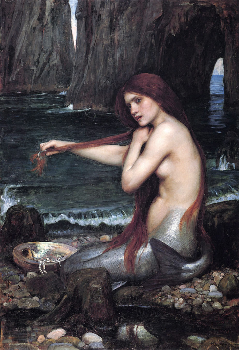
You are alone on an uninhabited island. Which mermaid would you choose as your companion? Classic mermaid – top-half woman, bottom-half fish – or inverted mermaid – top-half fish, bottom-half woman?

image

In 1934, abstract artist René Magritte painted Collective Invention – a play on the idea of a mermaid. This mermaid has the lower-body of a woman and the upper-body of a fish. Despite having beautiful, functional legs, the “mermaid” is gazing expressionless and lying on its side. You would think that a fish with legs would be using them, but clearly this creature is too foolish, or is possibly asphyxiating as its gills attempt to respire in vain. As opposed to the normal model of human-fish creatures, this one has gained the transportation and sex-organs that flummox the sea-faring men whom they tempt. What the creature lacks is the personality, and inner/outer beauty of the traditional sea-temptress. One misogynist, who clearly did not think the choice through, called this “a practical man’s mermaid”. 

Perhaps the question of the two mermaids is what part of a woman a man considers more important.

So which would you choose? Go.

image

Posted in Philosophy

Perfection

화룡점정 (Hwa Ryong Jum Jung) – 畵 그림 화 (painting). 龍 용 룡 (dragon). 點 점 찍을 점 (spot). 睛 눈동자 정 (pupil).

During the Liang Dynasty (modern day China), there lived a famous painter called Zhang Sengyao. It is said that he was such a skilled artist that his paintings were lifelike and almost like a photograph. 

One day, a monk asked him to paint a mural of dragons on the wall of his temple. Zhang accepted and proceeded to draw four dragons rising through black clouds. The fluid motion of the body, armour-like scales, the ferocious and vivacious look of the dragons… the sheer scale and detail of the painting astounded everyone who gazed upon the painting. However, people noted that none of the dragons had eyes drawn in.

When asked why, Zhang simply replied: “If I draw in the eyes, the dragon will immediately burst out of the wall and fly off.” No one believed him and laughed at such an insane comment. After constant pressure from the people to do it, Zhang reluctantly lifted his brush and plotted a single black dot where the eye was to be. 
Suddenly, lightning flashed and thunderclaps boomed out of the painting, from where a dragon emerged and proceeded to flash off into the sky. The people were speechless. The painting (minus the one dragon) still exists to this day.

To seek perfection is arrogance. This is a common mistake found in modern society, where people are too obsessed with becoming perfect and not see the beauty of imperfection.

Posted in History & Literature

Michelangelo’s Model

There are few (intellectual) people who do not know the master artist of the Renaissance, Michelangelo. His works are well-known for powerfully expressing the beauty of the male body and the energy it contains. However, there is a secret that lies in many of his paintings.

The work that most obviously shows this is the famous ceiling of the Sistine Chapel. This giant painting features many characters from the Bible and Greek mythology, one of which includes the Sybils, or female prophets. In particular, the one called The Libyan Sybil shows a woman holding up the pages of a large book. However, on closer inspection it can be seen that she has a very muscular build and very large shoulders – features of the male anatomy. In fact, this feature is found in almost all of the Sybils and many other supposedly “female” characters.

The reason being, Michelangelo was a misogynist and admirer of the male form, thus he frequently (and almost exclusively) used male models for his paintings. For example, the model of The Libyan Sybil was one of his studio assistants. He believed that beauty of the human body peaked only in men, which combined with his talents for expressing vigour and energy in his art produced some of the most powerful, masculine paintings.

Of course, him being attracted to the nude male beauty both aesthetically and emotionally have given birth to many theories that he was a homosexual.